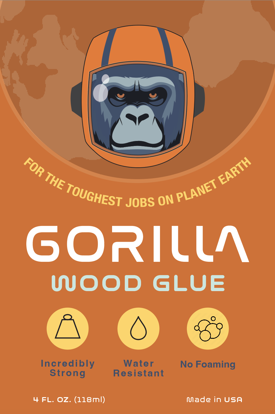
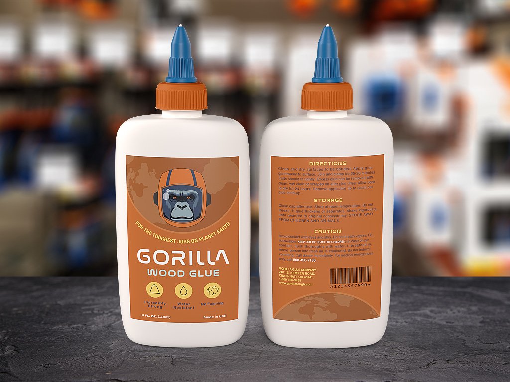
Gorilla Glue
(Package Design)
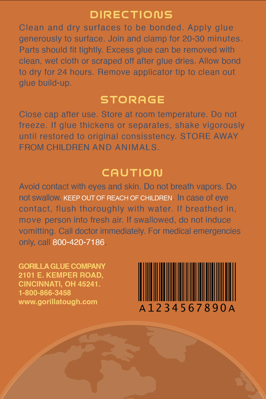
The concept behind this repackaging was to lean into the ‘Gorilla Glue’ tagline, “For the toughest jobs on Planet Earth” and conceive a Planet of the Apes inspired style featuring a space Gorilla. This package has a sense of humor about itself while still maintaining the stark orange of the classic Gorilla Glue bottles. The typography also supports said concept with a space/NASA style on both the front and back labels.